
Trump's Path to Victory (With a Nod to Washington State)
Last month, I posed this question: “If President Trump wins, what should we have paid attention to that would have allowed us to see it coming?” The article noted his improving job approval rating, his ratings on the stewardship of the economy, and potential problems with Joe Biden’s base as signs that he might perform well in the upcoming election.
But even a few weeks can be an eternity in politics, especially in the Donald Trump era. Since that essay was published, we’ve seen a Supreme Court justice die, Trump name a replacement, the leaking of the president’s taxes, the first debate, and the White House COVID outbreak. Also since then, polls have ranged from mixed (USA Today/Suffolk showing Trump tied with Biden in Florida) to very bad for the incumbent (CNN showing him down 16 nationally).
Obviously, for Trump to win this election, the reality as of today has to be closer to the picture painted by polls like the USA Today/Suffolk survey of Florida than to that of CNN. There are justifications for believing this is possible: In particular, differential response bias can create the appearance of surges of support when bad news hits one side or the other. We should also remember that it was almost exactly on this date in 2016 that the “Access Hollywood” tape dropped; if there has ever been a time that Trump looked to be dead politically, it was then.
Regardless, the possibility of a Biden blowout -- and what it would mean for Republicans -- will be the subject of a forthcoming article. For now, here are two indicators of the national environment I’ve used in analyzing previous elections that, if Trump were to win (or barely lose), would have been important, overlooked indicators.
1. As Goes Washington, So Goes the Nation? As early as 2010, I’d noticed that Washington state’s primary predicts November national outcomes fairly well. The idea is this: Washington has a primary where all the candidates run on a single ballot, with the top two advancing to the general election. The specifics have changed over time – in particular, the primary is held in August now rather than in September – but regardless, that unique format gives us a bit of a dry run as to how voting will go in the fall (California has a similar system, but its primary is held much earlier).
To get a sense of how well this works, take a look at the following chart. It shows the Democrats’ share of the vote in Washington primaries, juxtaposed against the Democrats’ share of the national vote in the fall elections. The closer a dot falls to the diagonal line, the better job the primary did of predicting the outcome in November.


As you can see, it’s a pretty tight relationship. There’s probably some non-linearity involved when judging from the extremes; with a larger dataset, we could better flesh that out. But overall, you can explain about 90% of the variation in the Democrats’ vote share in the fall by what you see in the late summer.
The data for 2020 was genuinely surprising. I had expected that it would look like 2018, when Democrats won about 62% of the vote overall in the September primary. Instead, the Democrats’ performance this year was slightly worse than it was in 2016: They won about 55.2% of the vote in 2020 versus 56% in 2016.
While this also doesn’t look like the Democratic performances in the very good Republican years of 2010 (50.1% of the vote) and 2014 (51.9%), Republicans don’t need a large popular vote victory like they achieved in those years (the state of Washington has also become more Democratic overall since then).
If we use a regression analysis to predict vote shares in the fall based upon performances in the summer, the predictions are virtually identical to the predictions for 2016: Democrats are projected to perform on average 0.8% better than they did in 2016. Using the median (to account for potential outliers), they are projected to perform 0.3% better. Given “error margins” on regression predictions, that is effectively a projection of no change.
I won’t bore you with residual plots, but one of the striking things about this model is that it performs relatively well even in years when there were late-intervening events. In 2008, for example, the average miss was less than a tenth of a point despite the economic meltdown.
This isn’t a definitive sign Trump will win, or that Republicans like Rep. Jaime Herrera Beutler can breathe easily (although judging by primary performance, fellow Rep. Kim Schrier, a Democrat, could be in for a tough race). It’s just to show that these actual votes paint a different picture regarding the overall environment than the largest Trump deficits in the polls suggest.
2. Special Election Drop-Offs. In 2013 I wrote a piece about Democrats’ “drop-off problem”: Their performances in special elections had regularly lagged President Obama’s performance in the 2012 election. This suggested either a drop-off in enthusiasm or a change in voters’ habits. As I wrote at the time, if this continued Democrats could have a very rough 2014.
The piece resurfaced in 2018 when Republicans found themselves in a similar situation. In fact, one of the major “nerd fights” of 2018 was whether special election data should be built into formal predictive models of the general election. One benefit of doing so is that they include actual voting data, rather than the sampling data found in polls, with its intrinsic inaccuracies and shortcomings.
The problem with taking it that far, however, is that the data are noisy, and susceptible to quirks. For example, there seem to be, for whatever reason, an unusually large number of special elections held in Kentucky. The Bluegrass State is one of the last great bastions of “ancestral Democrats” – people who vote Republican for federal office but still vote Democratic for state legislative and local offices. These Democrats almost never underperform the national ticket.
Also, most people looking at these data are looking at “two-party vote share,” which eliminates third parties from the calculation. At the congressional level this isn’t a great challenge, as third parties almost never gain any traction. In legislatures it is more common. For example, in one district in Philadelphia this cycle, the Democratic candidate ran about 30 points behind Hillary Clinton’s 90% vote share. That looks like a really bad result, until you realize that the “Amen Brown” party – centered on the candidate of the same name – took 30% of the vote, and that Brown is clearly left of center. So the data will show a 15-point drop-off in Democratic vote share when you look at two-party vote, even though nothing of the sort occurred.
Finally, the further back in time you go, the more difficult it is to find reliable presidential data broken down by legislative district. You end up having to either toss a large portion of the data, or use data from presidential elections held multiple presidential cycles before the special election. There are obvious problems with that.
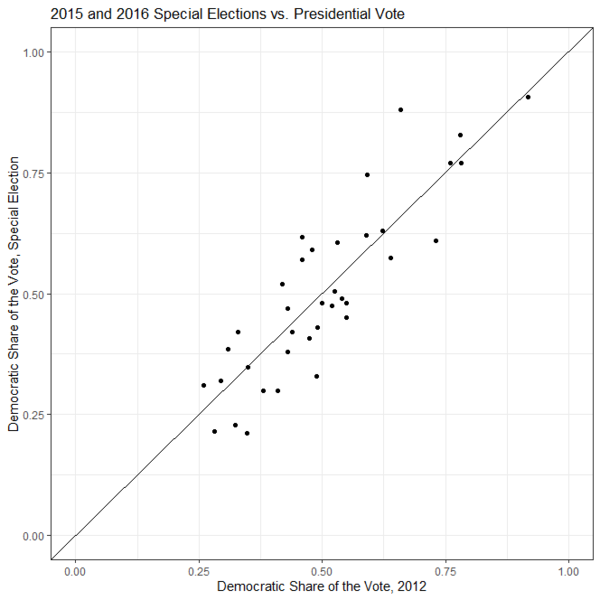
As a heuristic device for the state of the race, however, it’s proved a useful tool. To see this, consider the following chart from 2013 and 2014:
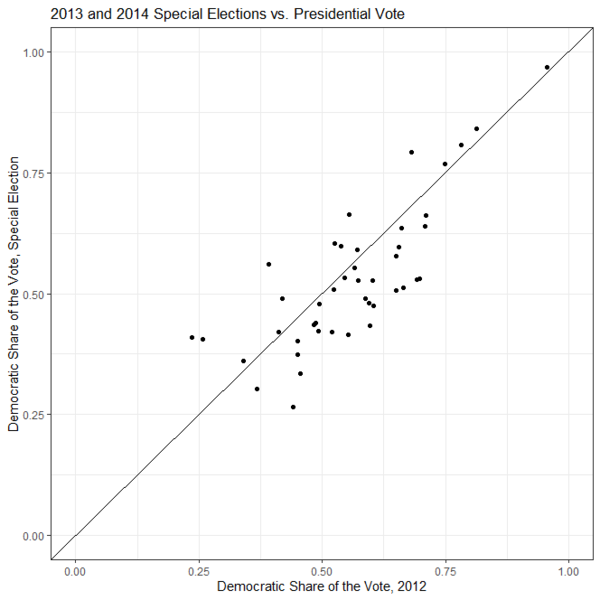
Reading this chart is fairly simple. The x-axis measures the Democrats’ performance in the most recent presidential election. The y-axis measures their performance in special elections. A plot point where the vote shares in the presidential and special elections were identical would appear directly on the diagonal line. An election where the Democratic candidate ran behind Barack Obama would appear below the line, while an election where the Democratic candidate ran ahead of Obama would appear above the line.
As you can see, Democrats fairly consistently ran below the line, consistent with them running behind Barack Obama. Indeed, this proved to be something of a harbinger, as Democratic participation fell in 2014, and Democrats lost nine Senate seats, while Republicans won their largest House majority since 1928.
What about 2018? It is effectively the mirror image of 2014. Most of the special elections are on the top of the line, suggesting that Democrats were overperforming Hillary Clinton’s showing. Again, this probably captured the zeitgeist for a very bad Republican year.
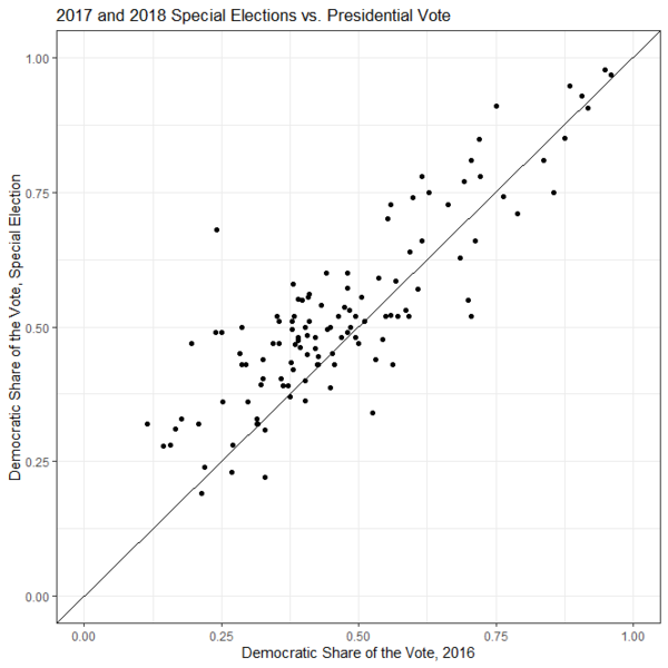
If we take this seriously, it should not have been a surprise that 2016 ended up being such a close election. The parties performed roughly equally in special elections – some ran ahead of Obama, some ran behind.
What do we see today?

If you squint hard enough, you can probably see a bit of a Democratic overperformance here. At the same time, we have to acknowledge that special elections paused in March, so we’re missing an important time period. Regardless, if we look at average under/over performance by year, we see that Democrats underperformed Obama’s vote share on average by 3.2 points in 2013/14 and by a tenth of a point in 2015/16. In 2017/18 they ran a full 5.4 points ahead of Hillary Clinton’s vote share, before falling back to 2.3% this time.
If we seek to minimize the impact of outliers by looking at the median, in 2013/14 Democrats ran 4.8 points behind Obama’s vote share, and in 2016 they ran 1.1 points behind Obama. In 2018 they ran 5.2 points ahead of Clinton, before running 2.2 points ahead of her this time.
One can look at this and observe that Trump had no room for error post-2018, so the fact that Democrats are tending to run ahead of Clinton right now is a good sign for them. On the other hand, the fact that they aren’t quite putting up the margins they did in 2018, and the fact that Trump doesn’t have to win the popular vote outright, would seem to be better news for the president.
Both of these metrics are more in the realm of what we might call “rough heuristics” – rules of thumb that don’t purport to get an exact answer on where an election stands, but that instead give a sense of the overall state of play. In a year when “fundamentals” models are probably broken by the pandemic-driven economic collapse in the spring and speedy recovery of parts of the economy over the summer and fall, this gives us a sense of the underlying playing field, which is more favorable to Trump than I expected. If he ends up winning, this will probably be a big clue as to why.
Source: https://www.realclearpolitics.com/


Comment(s)